All of the GUI (Graphical User Interface) files in Total Annihilation are found in the guis subdirectory, and are some of the more mysterious files in the game. Fortunately, for about 99.44% of us, we really don't care about what's in any of these files.
In a nutshell, the GUI files are used by the game developers to place "things" (usually referred to as "gadgets") on the screen in certain places. These gadgets, for the most part, include all of those push-buttons on the left-hand side of the screen while you're playing the game, such as the "orders" and "build" buttons, and the "next-menu" and "previous-menu" arrow buttons just below your build menus.
The following documentation was written by Dark Rain, I just formatted it into html.Document version 1.0 by Dark Rain
This is a description of the GUI file format used by TA to store menus layout information. It’s used in build menus, dialogs etc.
All the stuff in this file was found by trial and error and some deduction, hours of fun ^_^.
Each GUI file represents an interface on the screen, it can be full screen or just a small part of it. We'll call a GUI file as as whole an interface.
Each interface is divided into sub components called gadgets, these components can be anything from a button to a scroll bar.
Here's an example of a simple GUI file:
[GADGET0]
    {
    [COMMON]
        {
        id=0;
        assoc=205;
        name=Mainmenu.GUI;
        xpos=0;
        ypos=0;
        width=640;
        height=480;
        attribs=52685;
        colorf=52685;
        colorb=52685;
        texturenumber=0;
        fontnumber=-51;
        active=1;
        commonattribs=-51;
        help=;
        }
    totalgadgets=6;
    [VERSION]
        {
        major=-51;
        minor=-51;
        revision=-51;
        }
    panel=;
    crdefault=;
    escdefault=;
    defaultfocus=SINGLE;
    }
[GADGET1]
    {
    [COMMON]
        {
        id=1;
        assoc=126;
        name=SINGLE;
        xpos=139;
        ypos=393;
        width=96;
        height=20;
        attribs=2;
        colorf=0;
        colorb=0;
        texturenumber=0;
        fontnumber=0;
        active=1;
        commonattribs=54;
        help=;
        }
    status=0;
    text=SINGLE;
    quickkey=83;
    grayedout=0;
    stages=0;
    }
Each gadget is between the { }
[GADGET0]
    {
    [COMMON]
        {
        Gadget infos go here
        }
    }
Note that only the [] are necessary. We have to suppose that GAGDET1, GAGDET2 etc are for the benefice of a Cavedog Menu Editor. The following is valid:
[]
    {
    [COMMON]
        {
        Gadget infos go here
        }
    }
Each Gadget is divided in 2 parts, the common attributes and the gadget specific attributes:
COMMON
The common attributes are attributes
that are well.. common to each gadgets ^_^. This mean that each
gadget has all these attributes BUT it doesn't mean that all are
effective. Some just dont apply to a type of gadget, like a button
doesnt react to any change in size and width etc.
SPECIFIC
These are attributes that are needed for some type
of gadgets, for example, some gadgets need a text description or
they need to be grayed out or not etc.
Another important thing, is the first gadget. This gadget represent the interface itself. It defines the interface position on the screen, it's size, position, background graphic etc. All the following gadgets are for elements of the interface in question.
The ID, is the most important attribute of a gadget, it defines what the gadget is. Is it a button, text field, scrollbar etc? This ID decides it.
Here are the various values the ID tag can take and their effects:
| ID | Effect |
|---|---|
| 0 | The ID 0 is always used in Cavedog GUI files to represent the first gadget that defines the interface. However, this is like Gadget#, it'S optional and probably only for their interface tool. In truth, you can give to the ID of the first Gadget in the file any value. Personaly, I would leave it to 0, it could have unpredictable results. |
| 1 | Makes the gadget a button. |
| 2 | Creates a listbox. |
| 3 | Creates a textfield, it's doesnt have any borders, so you have to create them yourself in the background image of the form for example. |
| 4 | Creates a Vertical/horizontal Scroll bar. |
| 5 | It seems to makes the gadget the equivalent of a label for those familiar with VB. It allows you to place only text where you want to. |
| 6 | This creates a blank surface that will receive a picture at run time. It's used to display a small picture of the map when you're selecting a map, or to show a screenshot of your saved game. |
| 7 | It is used to set the default font for labels. |
| 12 | Used to display a picture box, really handy. |
Most of these gadget types need other optional fields or have extra possibilites, we'll discuss it later in this text.
The name is used for setting two things: the graphic used for the gadget, and the target for "events" that are hard coded.
GRAPHICThe name you choose for it, is used to look directly in a gaf file that has the same name as your menu file. For example, MAINMENU.GUI has a corresponding file named MAINMENU.GAF. As you may or may not know, GAF file are made of several image sequences that are packed inside of it and each sequence has a name. It will try to match that name with one inside the GAF file. Failling to do that, it will resort to using the default graphics for it's ID and for it's size. This is why the buttons in MAINMENU.GUI, which represent the main menu that appear when you open TA, use a button graphic even thought there's no corresponding sequence in the GAF file.
You have to understand that a menu, any menu, be it a unit menu or the battle room menu, has access only to the graphic sequence stored in the GAF file with it's name and the sequences in commongui.gaf. This is because all the sequences in commongui.gaf are treated like global variables.
To change those graphics, you can modify the default graphic in commongui.gaf but this will change the button for ALL the buttons using the default graphics. This is a bit clunky. The right way to do this, would be to create a sequence inside MAINMENU.gaf called INTRO (for the Intro gadget). Create it with two frame for pressed and unpressed and voila.
This open a lot of doors, this would allow TC to assign a different graphic to each button, sure as hell makes for more variety than the same damn default button everywhere ^_^.
Note: I thought of adding all the units Build Pictures to commongui.gaf. It would save a LOT of space for GUI based menus and MDF (multi directional factories) would be able to be done with little or no additional space compared to normal factories. Sadly, adding anything to commongui.gaf crash TA on startup. I urge people to try to find a solution if you're interested but personaly I'm flat out of ideas.
EVENTFor a button to actualy do something, it has to be linked to an event that's often hard coded. In MAINMENU.GUI, you can see several button gadgets, one named INTRO, Credits, MULTI, SINGLE and EXIT. These 5 words are hard coded variable names for this menu. You cannot add one from another menu, as far as I can tell. So you cant really add functionalities to a TA menu, just substract some by not using them.
There's a lot of hard coded events, pretty much a completely different new set for each menu. The only way to know them, is to look at Cavedog original GUI files and deduce the event names from those buttons.
Something interesting to note, is that while you cannot add events, you can take out some. A use for this, is in a TC, to remove the Cavedog Logo that looks kind of ugly.
A button with a name that isn't linked to an event will be pressable but it wont have any impact on the game.
UNIVERSAL EVENT NAMEAs far as I can tell, HELPTEXT, works in every GUI. It's used as a label name, to make it display information about the gadget your cursor is on. It seems that the info is hard coded sadly, so you can't add new ones. I'm really not sure about this so if anyone else finds out gimme a call ^_^.
These ones are pretty obvious, it just specifies the width and height of a gadget. However, it's useless for most types of gadgets, since buttons, labels and picture boxes aren't affected by it.
These two tags represent the x, y coordinates of the gadget. Pretty easy, but there's a detail to know. For the first gadget, the x/y coordinates will be respected ONLY if it still allows the interface to fit completely on the screen. This is why in MAINMENU.GUI, you need to reduce the interface width and height to something smaller than 640x480 before you move it around.
If 1, then the gadget will be visible, if 0 then it's hidden.
I found ONE use for this but I'm sure I'm missing something. When you set a custom font, it sets all the labels to this font. Well if you set fontnumber to something differant than 0, then it will use the default TA font again.
There's only one use for it, that I've stumbled upon. For scrollbars, the value for vertical has to be 2, and 1 for horizontal.
I did a lot of searching to find this one and I'm sure I'm only scratching the surface.
What it does is very simple, it associates gadgets together (duh). For 90% of the gadgets I've seen so far, the value of assoc doesn't change anything. It gets activated only when it's used with gadgets that are what we'll call "assoc aware". So far, I found only 2 such gadget that can communicate with each others, it's the scrollbar and the listbox.
When associated together, the listbox will tell the scrollbar how many item it has, what length the knob should have etc. The scrollbar on the other hand, will tell the listbox when to scroll up or down the list as the user moves it around.
Useless side effect: When 2 scrollbars have the same assoc number, using the arrows to make the knob move will result in making the knob on the other scrollbar move as well.
I'm sure there's more to it, but I cant seem to figure it out.
Unknown, but appears to do nothing.
Unknown, but appears to do nothing.
Unknown, but appears to do nothing.
I'll describe these tags below, with the gadget they're used with. It'll simplify things greatly, since many have to be used in conjunction with each others.
Many of these tags have default value of 0 or empty text - but in game, the value isn't 0 or the text is something else. This is because gadgets that have an event name, in the current interface, are checked by TA and may have certain variable values changed.
One last thing, some gadgets are invisble in game but you KNOW they're there and they should be visible. Things like buttons or labels. This is because TA checks for gadgets with some specific event name and makes them invisible under some circumstances.
The header is the first gadget in an interface that I spoke of earlier. The special tags are:
| Tag | Description |
|---|---|
| totalgadgets | This is used to indicate the total number of gadgets in the interface but it's a bogus tag. It doesnt have any effect on the interface, that I can see. |
| panel |
This is used to set the background picture of the interface.
If the interface already use a PCX based background, then
leave it blank "panel=;" Setting the gaf works a bit like the name tag, it refers to the name of a sequence in a gaf file with the same name as the GUI menu or a sequence in commongui.gaf. |
| crdefault | I have no idea yet. |
| escdefault | This indicates the name of the button that will be triggered when the Escape key is pressed. |
| defaultfocus | This contain the name of the button that will have the focus when the interface opens. The focus in-game is represented by the glowing rectangle. |
| Version |
This bit has to be added, and it must come after the common section.
Put whatever values you want to, it doesn't matter.
[VERSION]
    {
    major=-51;
    minor=-51;
    revision=-51;
    }
|
Example gadget:
[GADGET0]
    {
    [COMMON]
        {
        id=0;
        assoc=205;
        name=Mainmenu.GUI;
        xpos=0;
        ypos=0;
        width=640;
        height=480;
        attribs=52685;
        colorf=52685;
        colorb=52685;
        texturenumber=0;
        fontnumber=-51;
        active=1;
        commonattribs=-51;
        help=;
        }
    totalgadgets=6;
    [VERSION]
        {
        major=100;
        minor=-51;
        revision=-51;
        }
    panel=;
    crdefault=MULTI;
    escdefault=IGPATCH;
    defaultfocus=SINGLE;
    }
The special tags for a button are:
| Tag | Description |
|---|---|
| status |
For simple buttons, this dictates which frame of the
sequence in the GAF file the button will start on.
If you go past the max number of frames in the sequence,
the button will be invisible. For multiple stages buttons, the status has to be 0 or you'll get the wrong frame. |
| stages | This is used to indicate the number of stages a button has. For example, an On/Off button would have 2 stages. |
| text |
This is just the text of the button, type whatever you
want to. For simple buttons, you just type your text.
For multiple stage buttons, you have to
use "|" to separate the text of each stage of the button.
For example (3 stages): text=Continues|Ends|Deathmatch; |
| quickkey | This is a shortcut key that you can set for the gadget. The key is an ascii number. Consult your nearest ASCII character table for more info ^_^. |
| grayedout | Tells if the button is grayed out not. It makes the button disabled but visible, unlike setting active to 0. |
Example of a simple button:

[GADGET4]
    {
    [COMMON]
        {
        id=1;
        assoc=126;
        name=INTRO;
        xpos=409;
        ypos=393;
        width=96;
        height=20;
        attribs=2;
        colorf=0;
        colorb=0;
        texturenumber=0;
        fontnumber=0;
        active=1;
        commonattribs=54;
        help=;
        }
    status=0;
    text=INTRO;
    quickkey=73;
    grayedout=0;
    stages=0;
    }
Example of a two-state button:


[GADGET6]
    {
    [COMMON]
        {
        id=1;
        assoc=0;
        name=ARMPREV;
        xpos=100;
        ypos=283;
        width=300;
        height=40;
        attribs=32;
        colorf=240;
        colorb=0;
        texturenumber=0;
        fontnumber=0;
        active=1;
        commonattribs=0;
        help=;
        }
    status=0;
    text=On|Off;
    quickkey=O;
    stages=2;
    }
Note: button text is aligned in the middle for simple buttons and it's aligned to the right for multiple stages buttons.
Well sadly, there's no special tags for it, so I'll just give an example:
[GADGET1]
    {
    [COMMON]
        {
        id=2;
        assoc=1;
        name=GAMES;
        xpos=10;
        ypos=10;
        width=242;
        height=176;
        attribs=1;
        colorf=15;
        colorb=0;
        texturenumber=0;
        fontnumber=0;
        active=1;
        commonattribs=54;
        help=;
        }
    }
Pretty simple gadget, just indicate it's size and position.
| Tag | Description |
|---|---|
| maxchars | The maximum number of character in the textbox. |
Example textbox entry:

[GADGET9]
    {
    [COMMON]
        {
        id=3;
        assoc=0;
        name=ADDRESS;
        xpos=53;
        ypos=61;
        width=250;
        height=26;
        attribs=0;
        colorf=100;
        colorb=0;
        texturenumber=0;
        fontnumber=0;
        active=1;
        commonattribs=-125;
        help=;
        }
    maxchars=30;
    }
Whether it's a vertical or horizontal scrollbar is decided by the width and height. One with say a width of 16 and a height of 184 will be a vertical scrollbar, where one with a width of 184 and a height of 16 will be a horizontal scrollbar.
With the height and width, you'll get the right appearance, but to make it fully operational, you also need the correct attribs value: 1 for horizontal and 2 for vertical.
| Tag | Description |
|---|---|
| range | This is the number of items the scrollbar contains. This isn't important, because it seems TA will always change it for scrollbars that have an Event name and an associate, besides, the result isn't visible. |
| thick | Doesn't seem to affect anything but I'm not sure. |
| knobpos | I assume it's a position within the range [0,"range"] from the "range" tag. Sadly, you can't pre set it, it doesn't do anything. |
| knobsize | This, is obviously the size of the knob on the scrollbar. This is also usually changed by TA when the srollbar has an associate. |
Vertical scrollbar example:

[GADGET1]
    {
    [COMMON]
        {
        id=4;
        assoc=243;
        name=KNOB;
        xpos=17;
        ypos=30;
        width=13;
        height=150;
        attribs=2;
        colorf=4;
        colorb=0;
        texturenumber=0;
        fontnumber=0;
        active=1;
        commonattribs=0;
        }
    range=151;
    thick=50;
    knobpos=0;
    knobsize=10;
    }
Horizontal scrollbar example:

[GADGET4]
    {
    [COMMON]
        {
        id=4;
        assoc=243;
        name=SLIDER;
        xpos=317;
        ypos=63;
        width=150;
        height=13;
        attribs=1;
        colorf=4;
        colorb=0;
        texturenumber=107;
        fontnumber=0;
        active=1;
        commonattribs=10;
    }
    range=151;
    thick=100;
    knobpos=0;
    knobsize=10;
    }
Labels are used to display text, you can place them anywhere inside the interface and make them say whatever you want to.
| Tag | Description |
|---|---|
| text | This is the text that the label will display on the screen. Like scrollbars, if the label name is an event name, then the text you pick might get changed by TA at run time. |
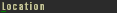
| link | This is used to link a label to a button. What will happen is that when you click on the label instead of the button, it'll act just as if you clicked on the button. To make it work, just give the name of the target button as the link value. |
Example label linked to a button:
[GADGET3]
    {
    [COMMON]
    {
        id=5;
        assoc=243;
        name=TEXT;
        xpos=476;
        ypos=132;
        width=117;
        height=13;
        attribs=17;
        colorf=0;
        colorb=0;
        texturenumber=0;
        fontnumber=0;
        active=1;
        commonattribs=0;
        help=;
        }
    text=Location;
    link=StartLocation;
    }
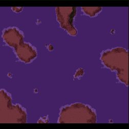
As I mentioned earlier, blank surfaces, are dynamic picture boxes. They're used in TA mainly to display the Mini map, previews when you're selecting a map, to show the minimap of your saved games etc. Just make sure it has the right event name so that TA can fill it with a nice picture.. Ooooooooooh a map. (I'm tired I think ^_^;)
| Tag | Description |
|---|---|
| hotornot | This is used to enable the selection rectangle visible on button and such to be visible on the Blank Surface. If hotornot = 1 then it's visible, if it's equal to 0 then the focus rectangle is invisible. |
Example map image:
[GADGET2]
    {
    [COMMON]
    {
        id=6;
        assoc=0;
        name=MAPPIC;
        xpos=328;
        ypos=78;
        width=252;
        height=252;
        attribs=0;
        colorf=15;
        colorb=0;
        texturenumber=0;
        fontnumber=0;
        active=1;
        commonattribs=0;
        help=;
        }
    hotornot=0;
    }
This sets the default font for labels for the whole interface. Sadly, I havent been able to change the font color or size yet, so you're stuck with black colored fonts.
| Tag | Description |
|---|---|
| filename | This is the name of the font you want to use, check the fonts directory to know the names of the font. It's very important that you only use the name of the font in filename and not the extansion. So, for example, the files SMLFONT.FNT becomes filename=SMLFONT; |
Example usage of a different font:
[GADGET1]
    {
    [COMMON]
    {
        id=7;
        assoc=243;
        name=FONT2;
        xpos=600;
        ypos=321;
        width=26;
        height=66;
        attribs=13;
        colorf=15;
        colorb=0;
        texturenumber=100;
        fontnumber=9;
        active=1;
        commonattribs=-125;
        help=;
        }
    filename=SMLFONT;
    }
This allows you to display a picture of a GAF sequence. As usual, the name corresponds to the sequence in the GAF file that you want the picture to display.

[GADGET4]
    {
    [COMMON]
        {
        id=1;
        assoc=0;
        name=ARMSOLAR;
        xpos=0;
        ypos=27;
        width=64;
        height=64;
        attribs=32;
        colorf=15;
        colorb=0;
        texturenumber=0;
        fontnumber=0;
        active=1;
        commonattribs=4;
        }
    }
Well that's it for now. I'll probably update when I find what the 3 mystery tags do ^_^. For more infos or questions email me at rochdenis@hotmails.com